Amazon: PeopleInsight Engage Tool
Enterprise tool for operational leads to connect with their associates
OVERVIEW
THE PRODUCT
Enterprise tool that allows operational leads to strengthen their relationships with their teams and to create positive workplace experiences.
ACCESS RESTRUCTURE
The Problem: Our customers are restricted in sharing their direct reports with other managers. How can we give our customers the flexibility to share with others without compromising data privacy and confidentiality?
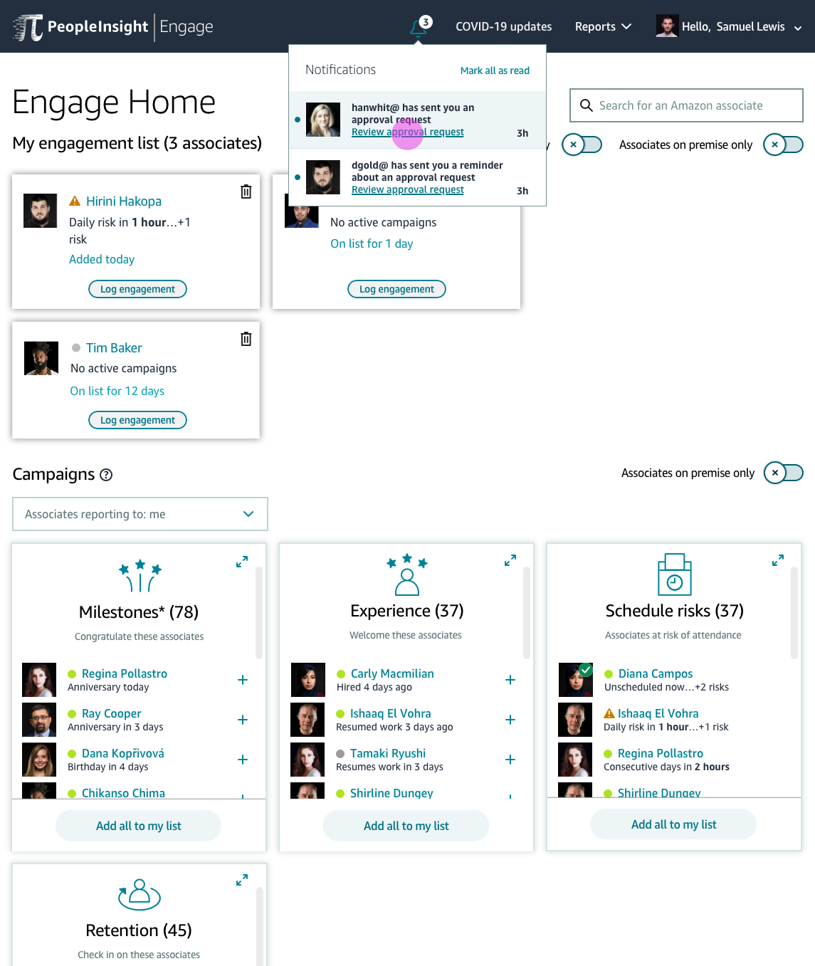
The Solution: Designed an extensive permissions sharing feature involving requesting access, granting access, extending access, and approving/denying access requests. Also designed accompanying notifications and reminder feature.
The Process: Defined business and legal requirements with Product and Engineering, identified core user tasks and created user flows, competitive analysis into external tools for sharing resources, wireframe exploration, high fidelity mocks, digital prototyping, and a usability test study conducted with 8 direct customers.
Eric is an Area Manager at an Amazon Fulfillment Center who has almost 200 direct reports that he checks-in with daily using the Engage application. But he’s leaving on vacation soon and he doesn’t know how to make sure his direct reports are covered by a different manager while he’s out. This is a feature gap that the PeopleInsight Team identified, and we dedicated resources into creating a new Share Permissions model for these use cases.

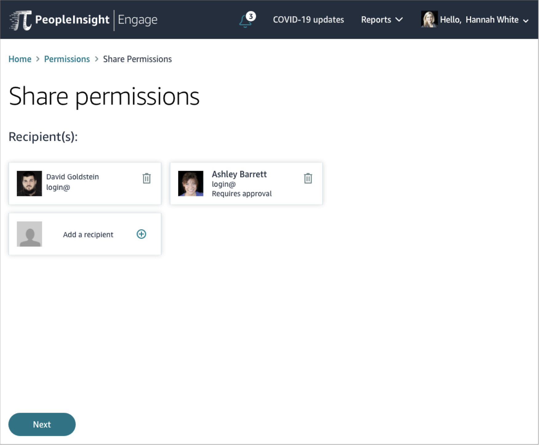
All eligible approvers wireframe
My Role: UX Designer with PeopleInsight team.
Tools: Pen, paper, SketchApp, Invision
Artifacts: Competitive Analysis, User flows, Sketches, Wireframes, High-fi mockups, Digital Prototype, Animated Digital Prototype, Usability Test Script, Usability Test Report
Team: Part of a 10-person UX Design Team, collaborated heavily with Product lead and Engineering team
PERSONA + CUSTOMER PROBLEM
USER FLOWS
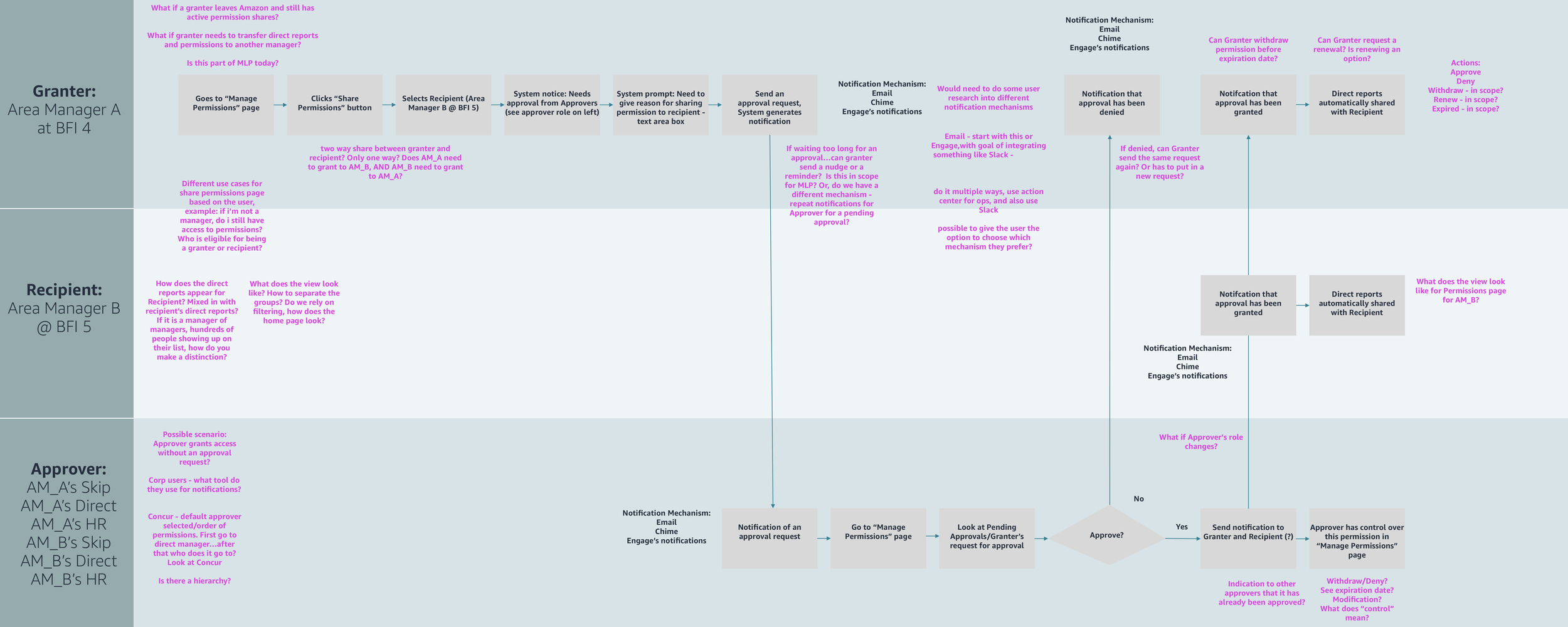
The first thing I did to solve this problem, was to map out an initial, “ideal” user flow detailing how an Amazon Area Manager could share permissions and request approval for their intended recipient. I detailed how the the request would flow through three different users: the granter, the recipient, and the approver, and I focused only on the happy path as a quickstart. Once I did that, I spent time analyzing the flow and writing down questions I had about the flow, challenging my own assumptions. What if the there was a time limit for how long a request could be active? What if an approver wanted to withdraw permissions? I wrote these questions in pink and placed them along the flow below.
Next, I met with Product and Engineering not only to review this flow, but to also ask all of my questions and get their perspectives/answers. I recorded them down in blue text, and in the discussion we identified that there needed to be additional features and user flows to fully flesh out the requesting, sharing, and approval experience.
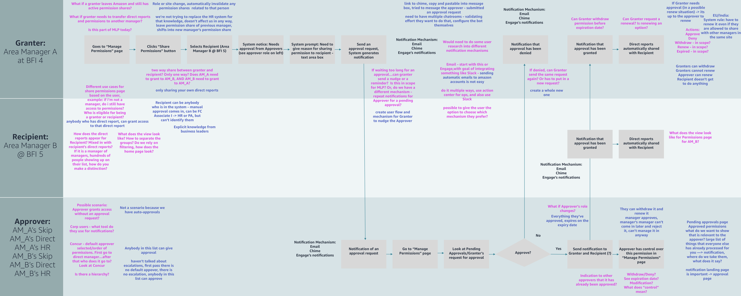
If I didn’t go through this user flow with stakeholders (engineering and product), then I wouldn’t have been able to build out all other user flows for other user actions. This helped me not only map out the ideal “happy case” flow, but also helped me understand edge cases, identify any gaps in the flow, and identify other user actions: withdrawal actions, and send reminder actions.
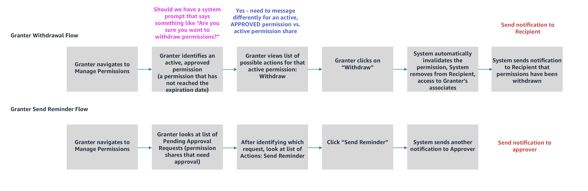
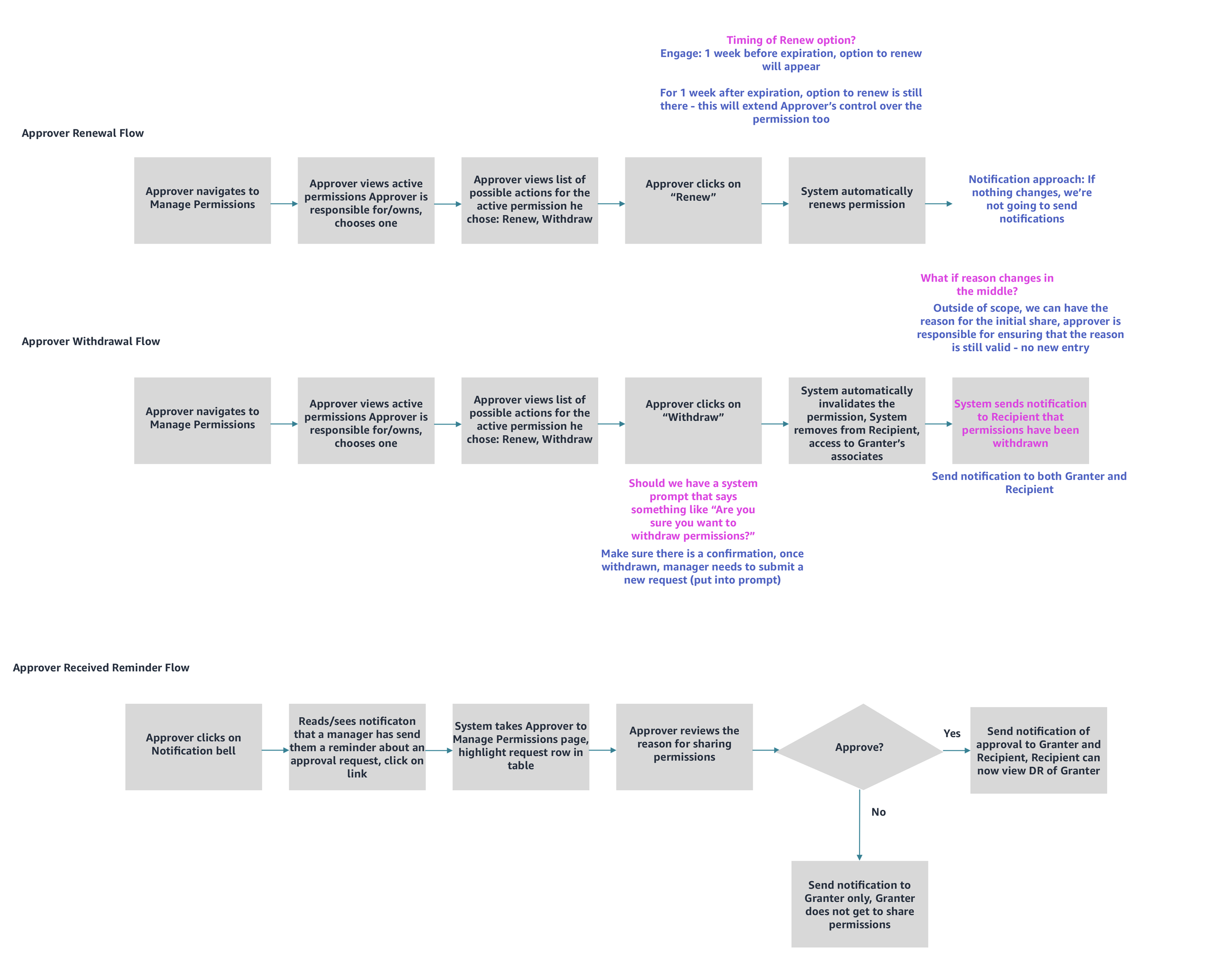
The above images are additional user flows I created for the additional features we needed: permission withdrawal flows for both granters and approvers, as well as send reminder flows, and a permission renewal flow. These flows ultimately became a “map” for what I needed to design in my wireframes in the next stage of design.
WIREFRAMES & CONCEPTS
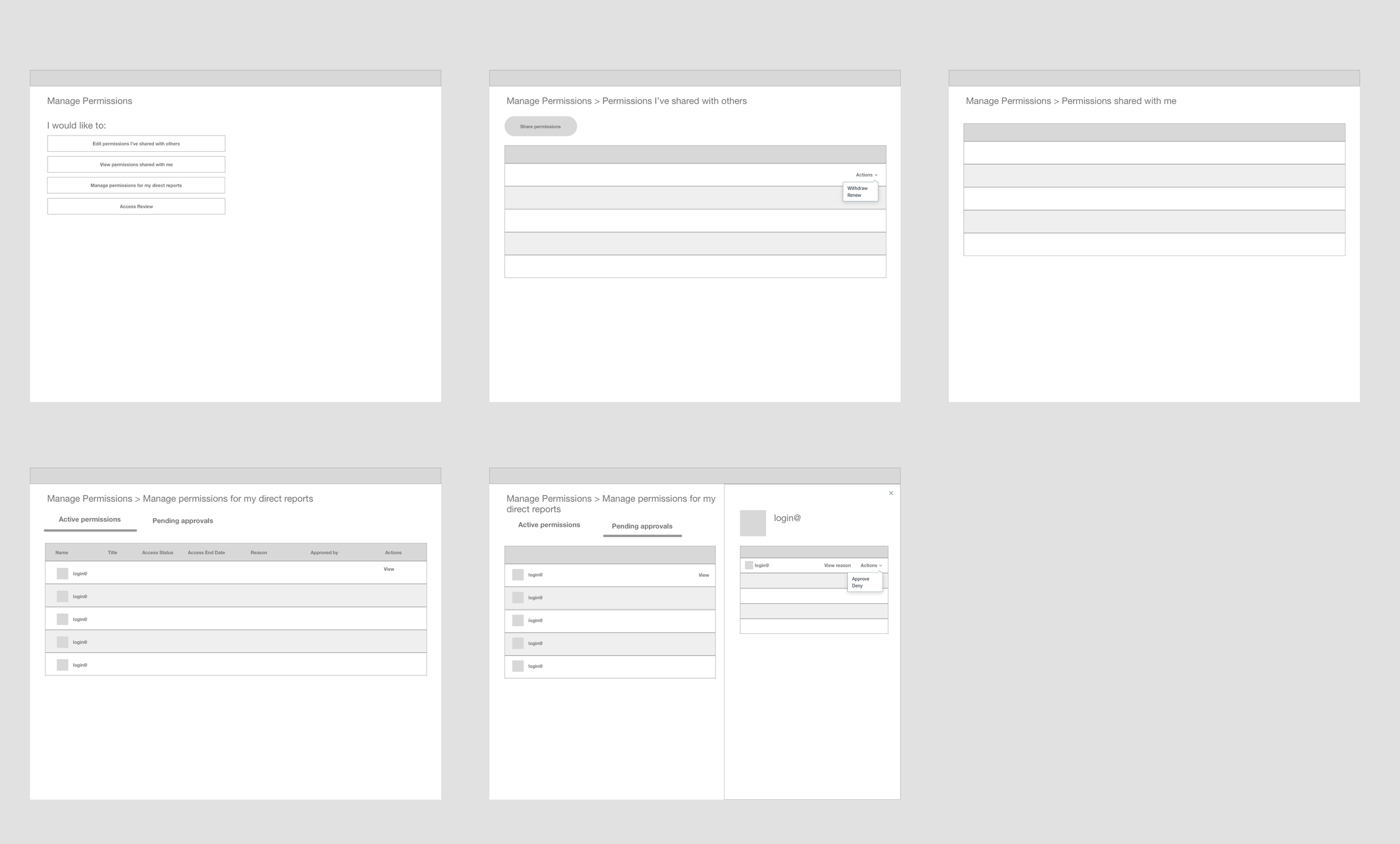
Below is an image where I explored different wireframes for the Approver flow. I spent time creating low-fidelity concepts breaking down all the different permissions the approver would need to track:
Permissions I’ve (as the approver) shared
Permissions shared with me
Pending approvals
All approved permissions
Initially envisioned an “Admin page” where the approver could access all of these options as different pages. One major problem with some of these design proposals is when an approver needs to review any pending approvals; the substeps of reviewing the requester, the recipient, and the reason creates a third level of information hierarchy and navigation that can be confusing. As in the last screen in the below image, there is a slide-out panel on the left, I felt that it there was not enough room to fit in all of that information, especially when considering smaller screen sixes. I eventually moved away from this option to recommend using tabs instead (see mid-fidelity wireframes in the next section.)
Granter/Requester Flow
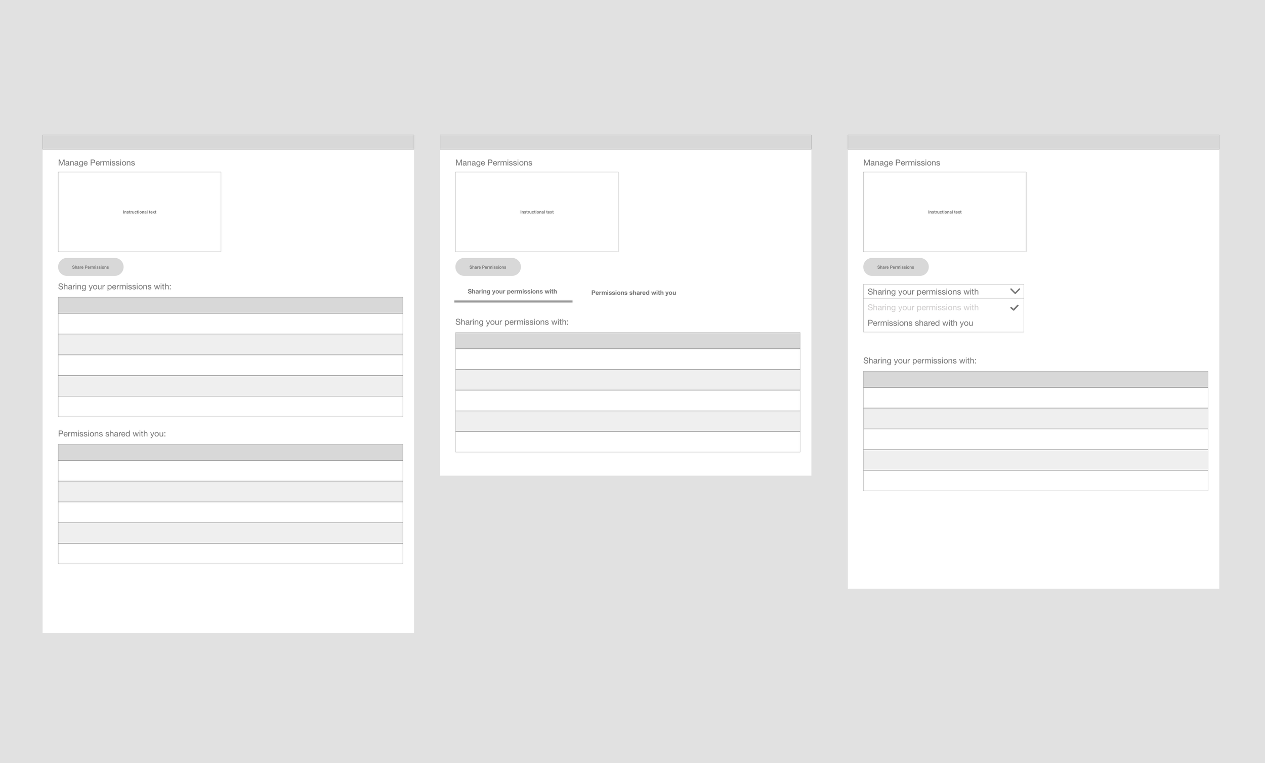
Exploring how to show the Granter’s shared permissions, explorations included using different components from the Stencil Design System such as showing two tables at once, or cognitively separating the information into two tabs, or a drop down. Moved away from the drop down because I felt that it was less discoverable than the tabs.
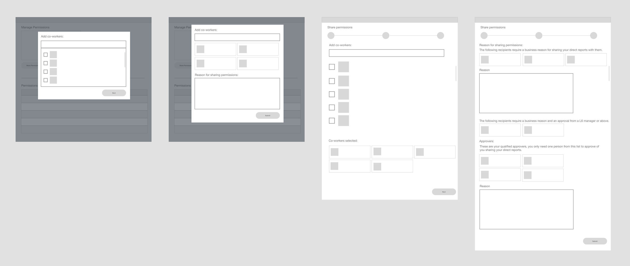
Sharing permissions flow
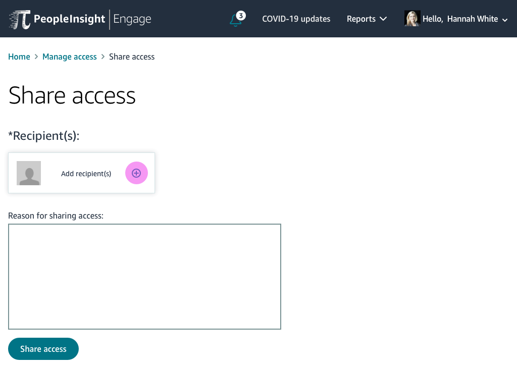
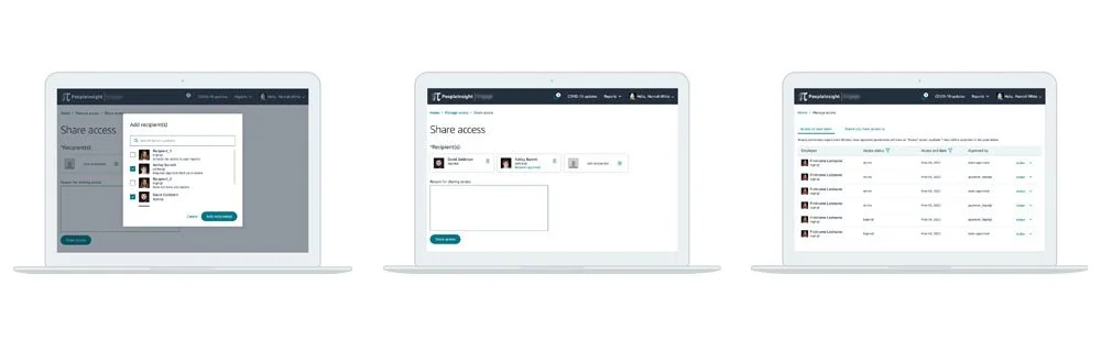
Variations on sharing permissions flow, where a granter selects recipients to share associates with. First two screens are explorations around single-select, third screen explores options for a multi-select, and the last screen explores trying to put in reasons for different types of permissions.
MID-FIDELITY WIREFRAMES
After spending time exploring different wireframes, I decided to move forward with using tabs to separate all the different permission sets the approver needed to view in a single page.
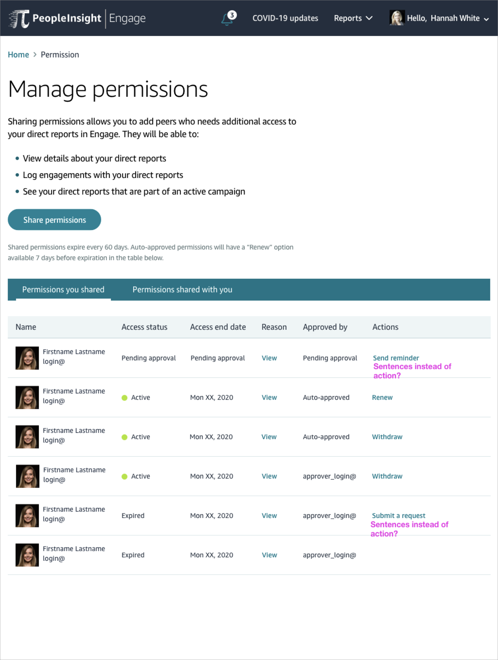
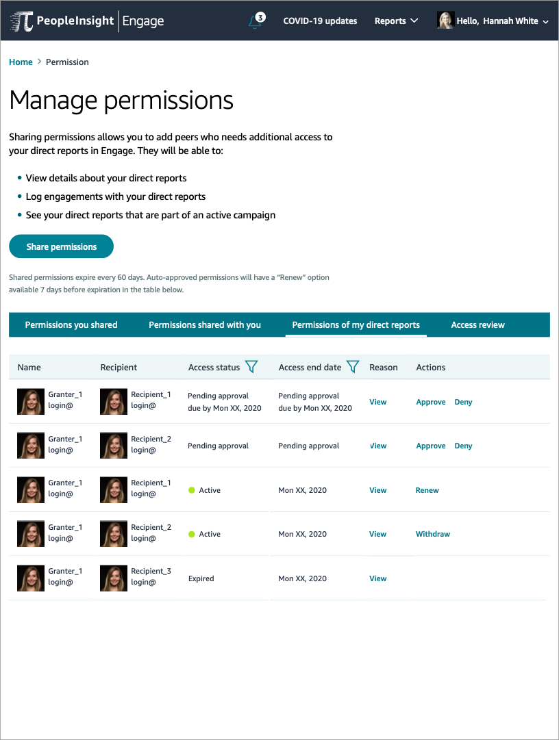
Exploring mid-fidelity wireframes also let me focus on refining some of the micro-interactions as seen in the above two images. I had questions on how to phrase content and actions, but also thought about if there were more than one action available.
Share Permissions mid-fidelity wireframes
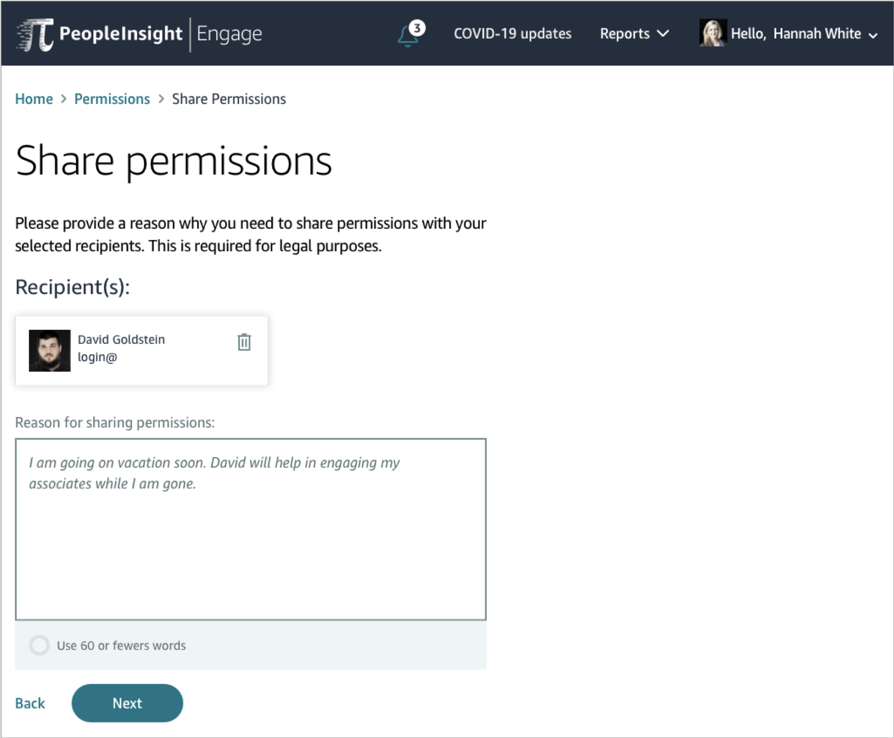
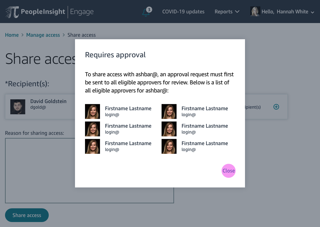
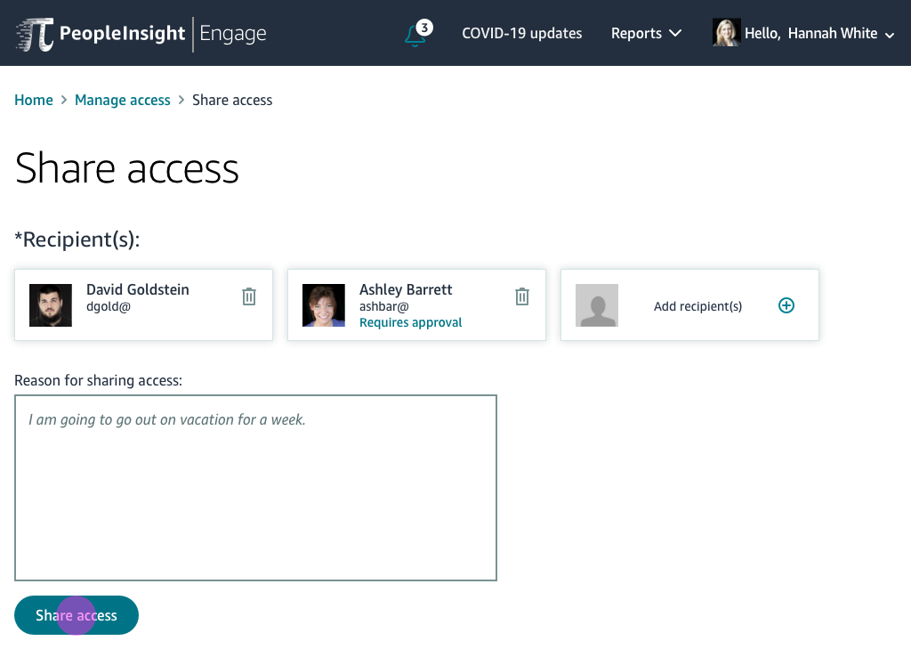
Mid-fidelity wireframes above show how a user can re allowing the user to request approval and filling out a reason. Goal was to communicate to the user all the eligible people who could approve their request.
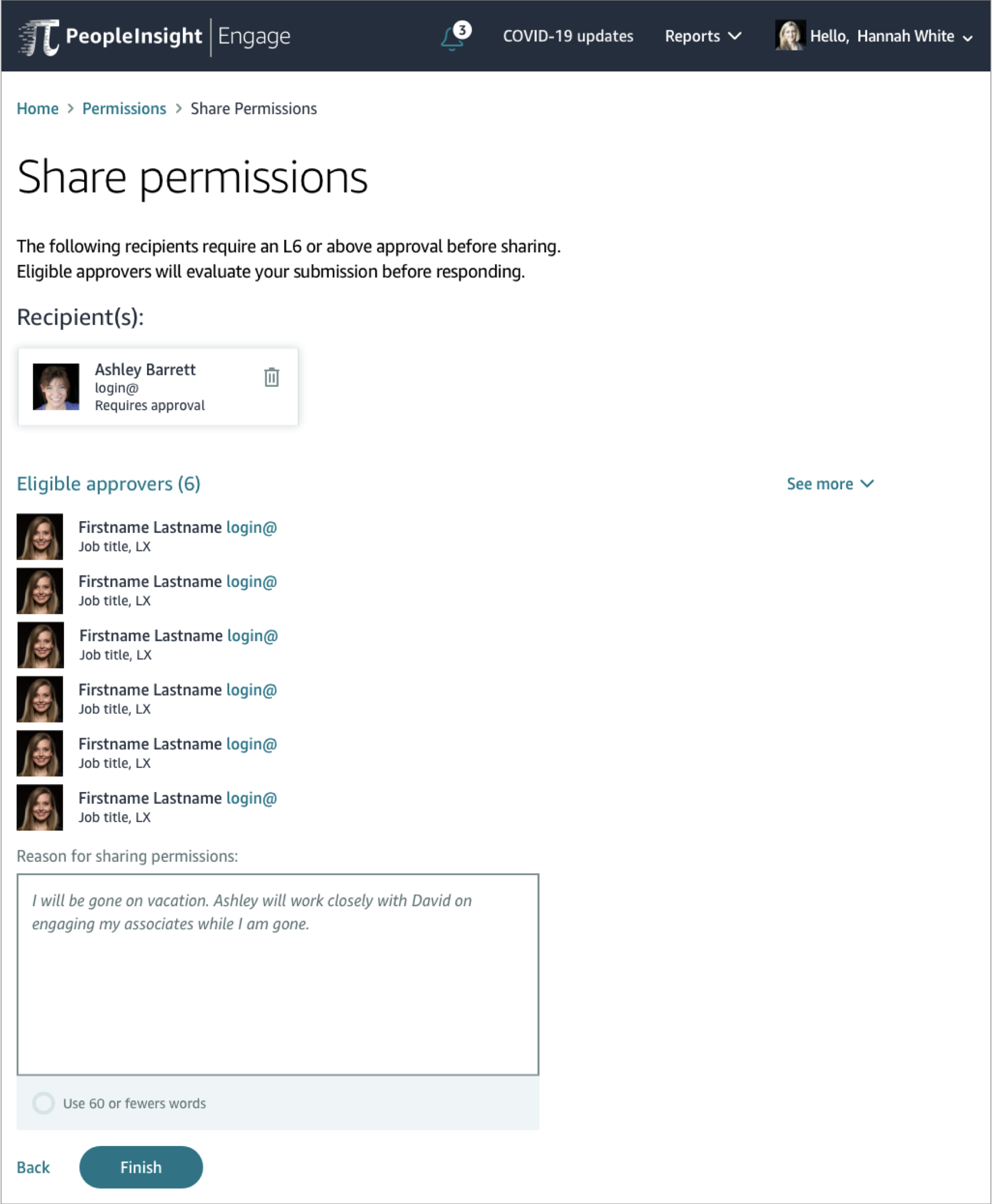
Also an intermediate wireframe, this is an example of what the user might look at when trying to fill out a reason for an approval request. Specifically this section allows them to see all possible eligible approvers, in case they ever want to reach out to them.
USABILITY TESTING & RESULTS
Created a clickable prototype using Invision, and conducted a usability test study:
Recruited a total of 9 participants: operational managers from different distribution sites
3 participants tested with Granter tasks
6 participants tested with Approver tasks
Rapid iterative usability testing
Remote testing through video chat
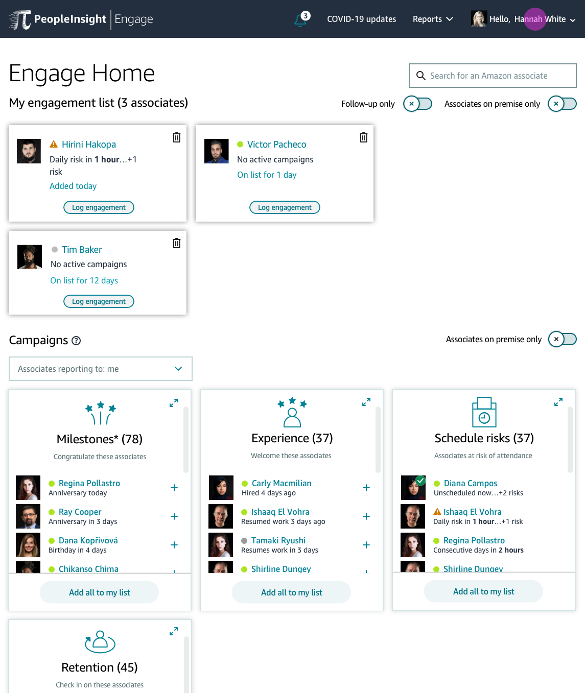
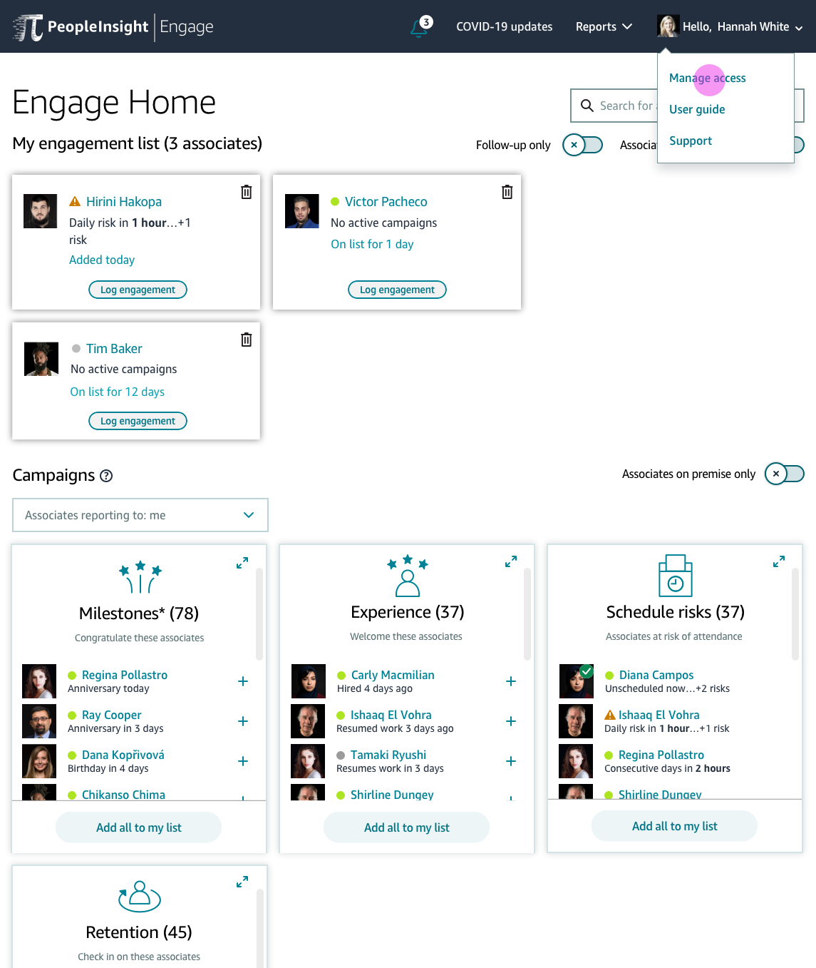
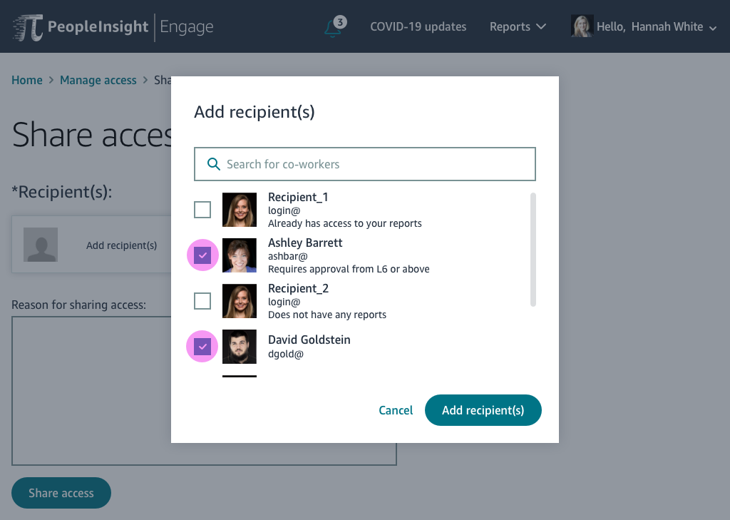
Results:
Customers wanted external notifications to alert them of permissions that have been requested, approved or shared
Customers requested ability to determine their own access end date instead of default 60-day expiration date
Customers initially struggled with locating tabs, but with each task, they quickly identified where they were
Results helped guide in making final changes to the wireframes, and provided great ideas for new features or next steps on the project.
FINAL DESIGNS
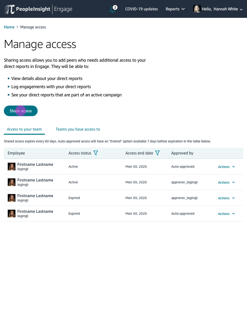
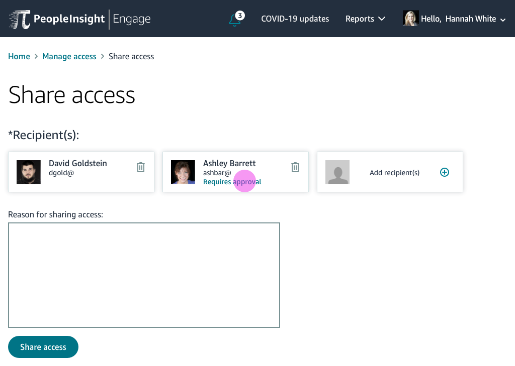
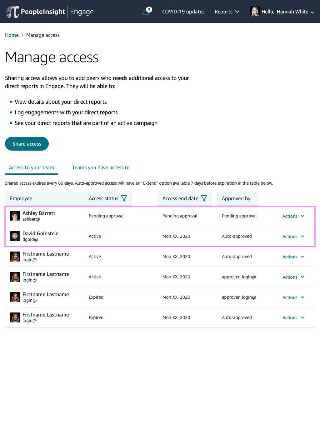
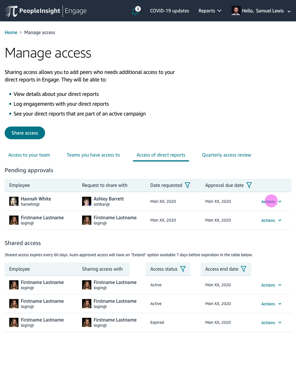
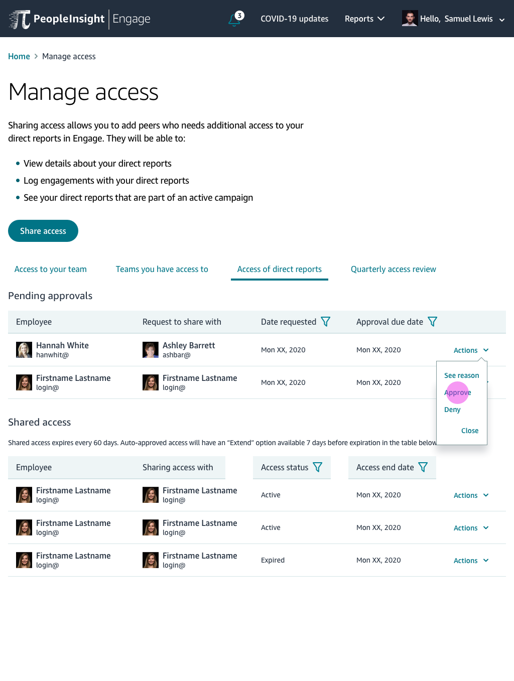
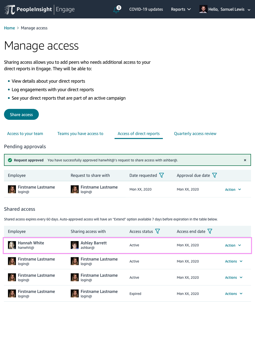
Approver Final Comps